Collection pages
Collection page settings
Collection and Product grid settings and configuration options
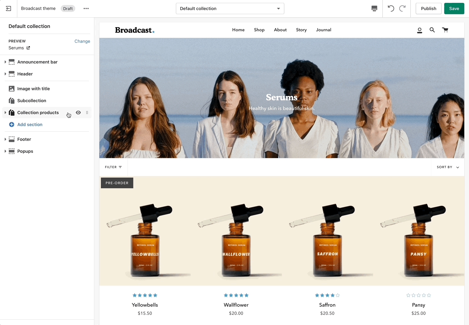
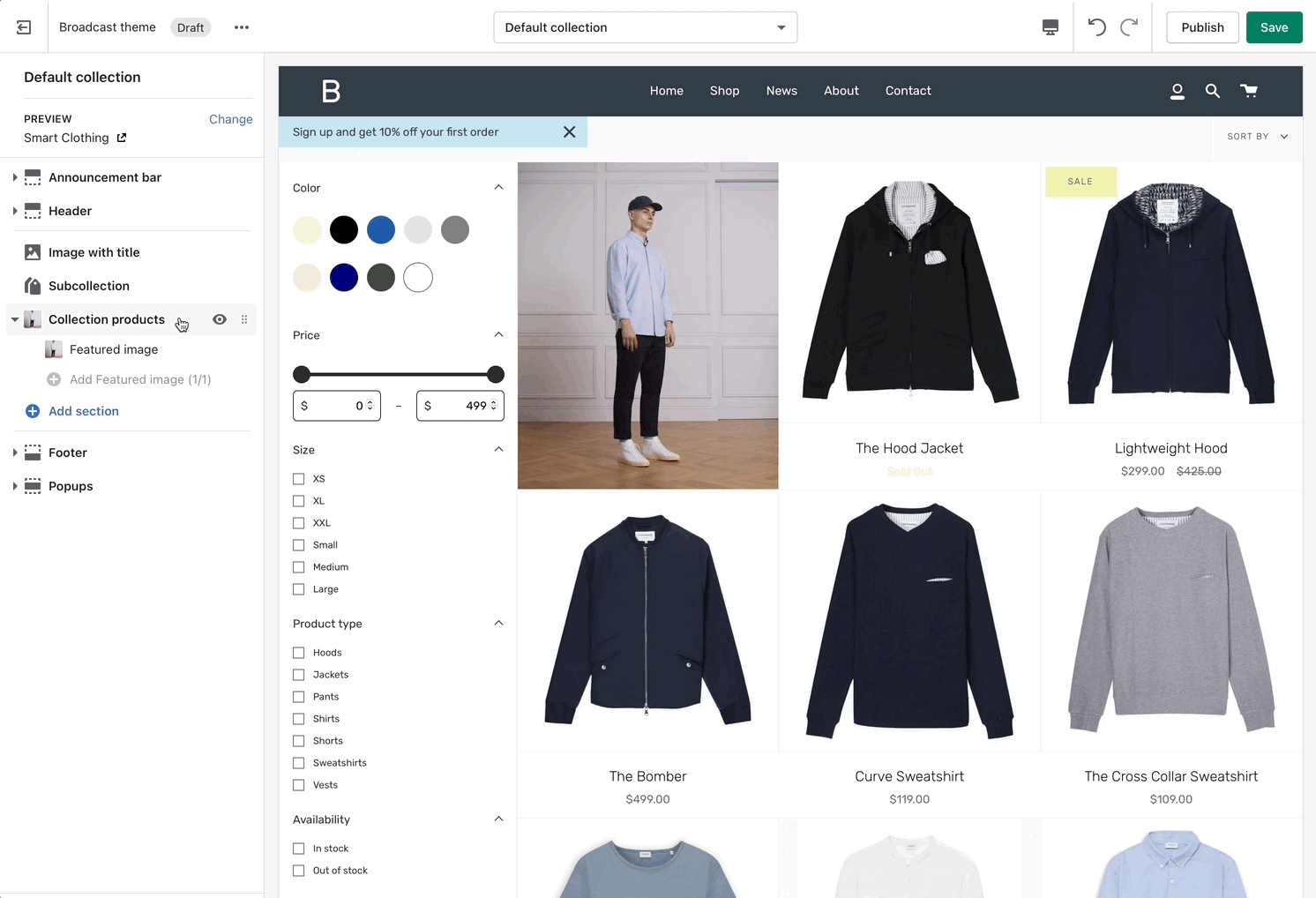
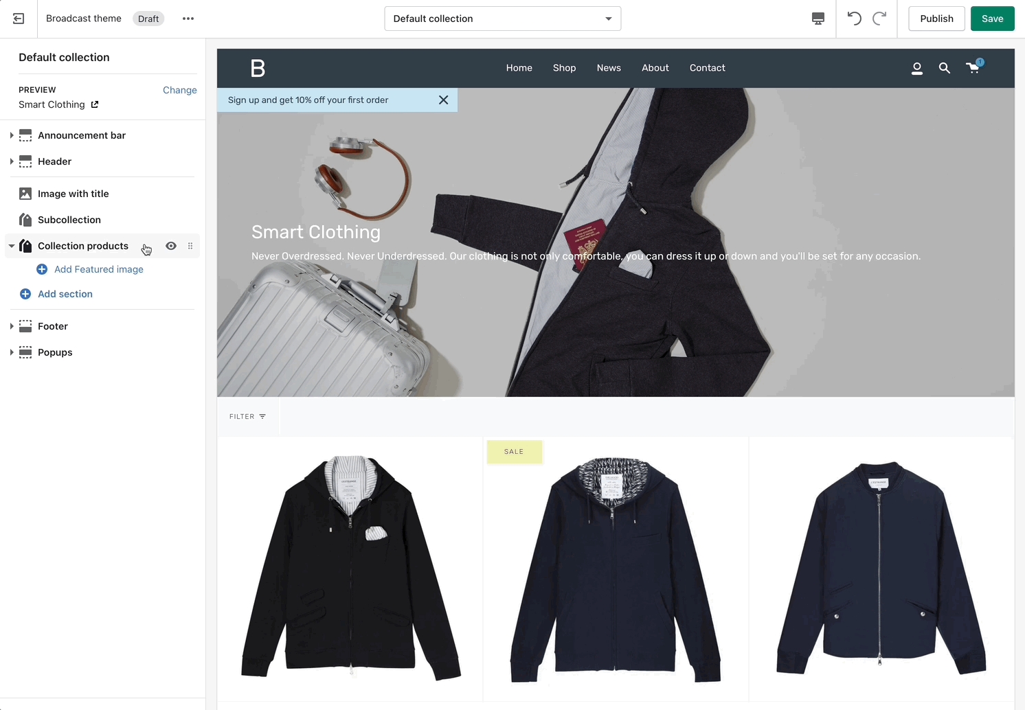
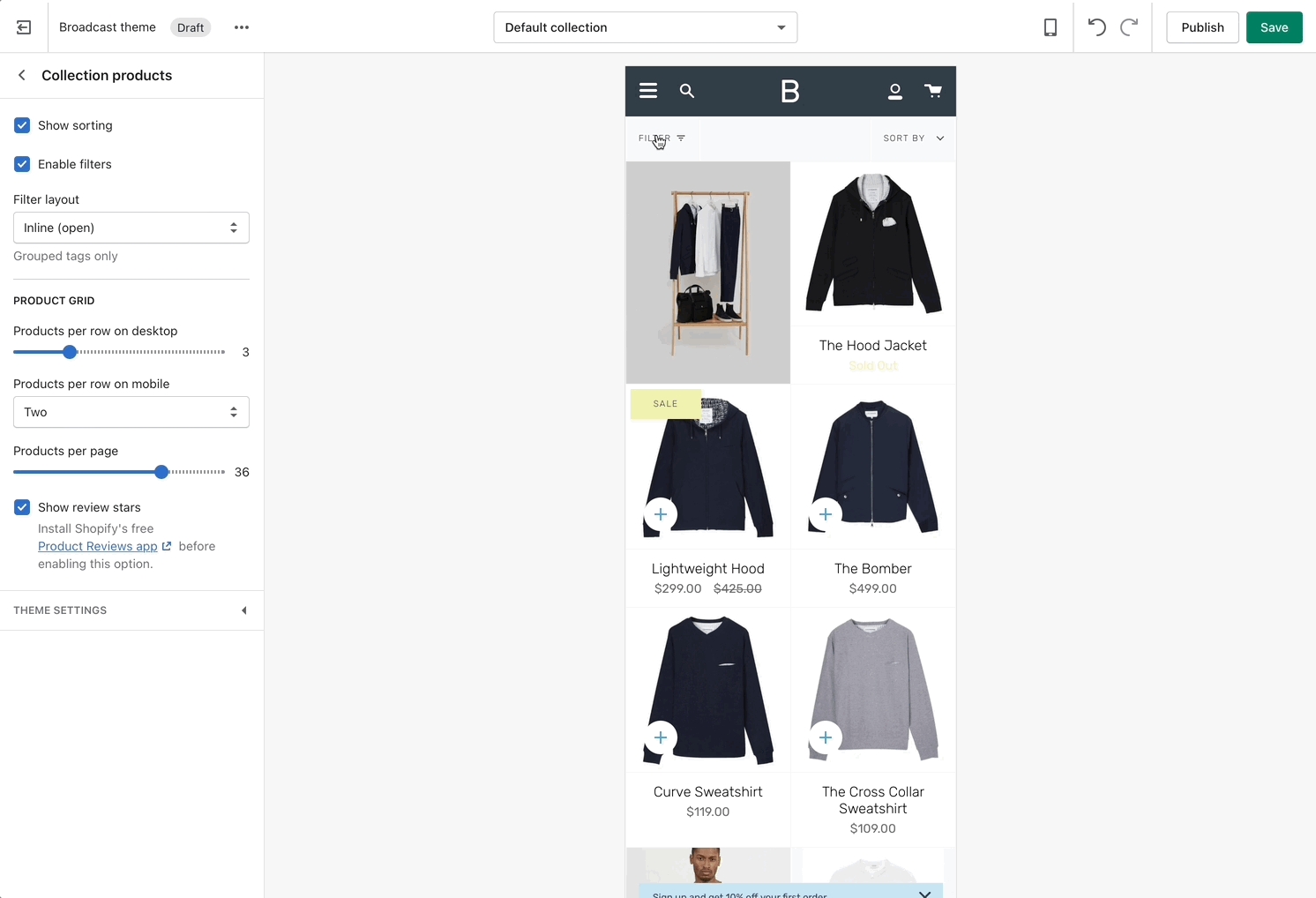
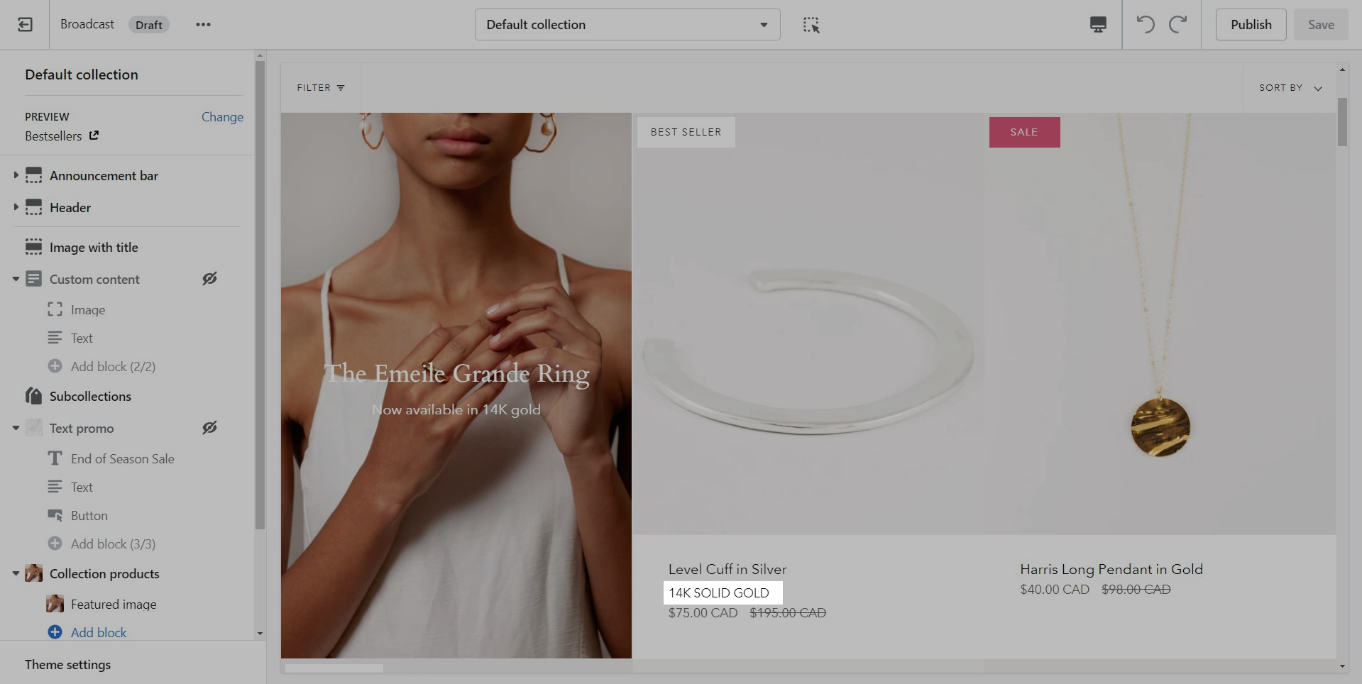
Click on 'Collection products' to view settings for Collection pages:

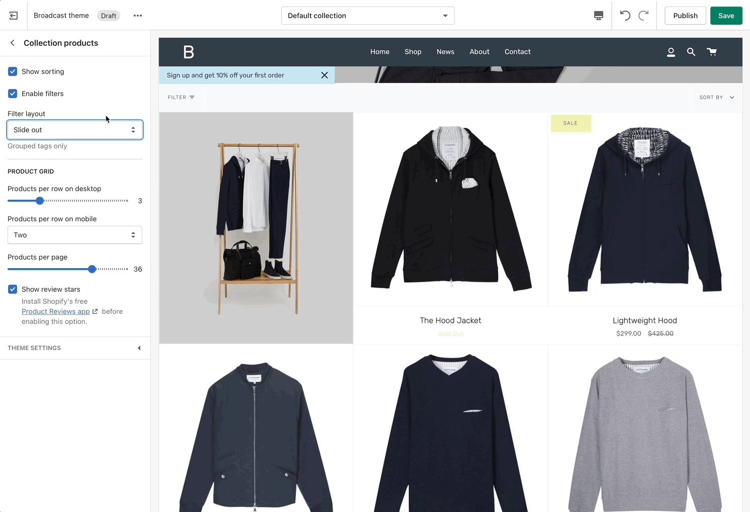
Product Grid
Use the Product Grid options to customize how many products per row are displayed on desktop and mobile. You can also configure how many products per page are shown before pagination is displayed.

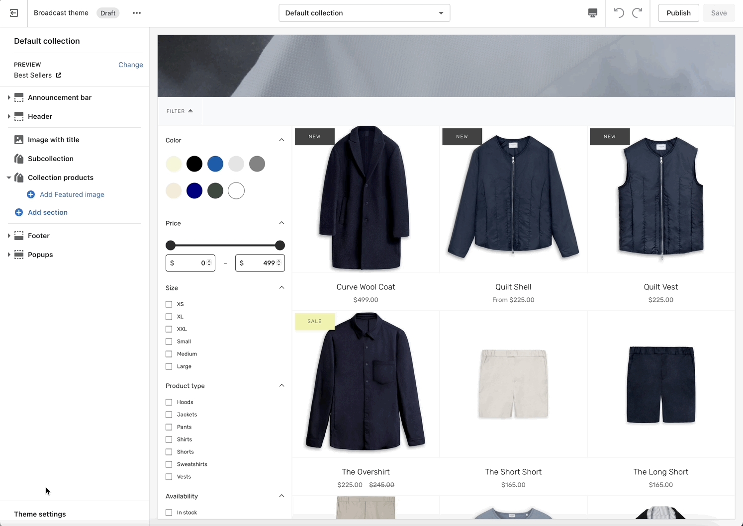
Theme Settings
Expand the Theme Settings panel to view additional settings related to the product grid:

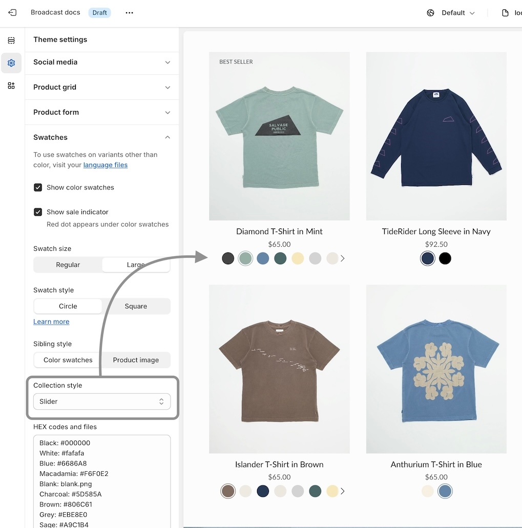
Swatch collection styles
Customize the swatch and siblings display style on collection pages and all product grid listings
Introduced in Broadcast 5.6
Broadcast includes flexible swatch and sibling display options, including:
Circle or Square shaped swatches and siblings
Regular or large-sized swatches and siblings
In addition to the size and shape, Broadcast includes swatch and sibling collection styles for all your collection pages and product gird listings:
Examples of collection style options:
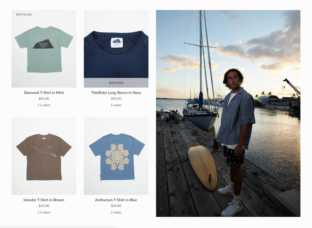
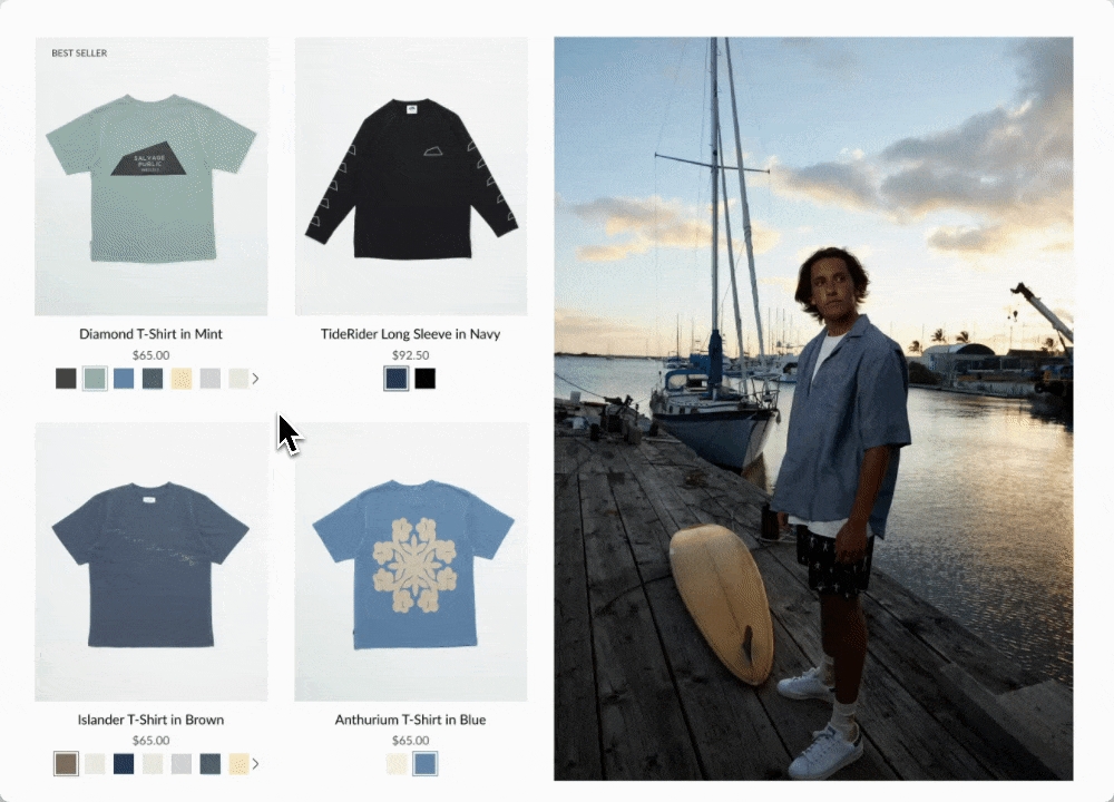
Slider on hover
Clean text is displayed on the Product grid. Upon hover, the text is replaced with swatches or siblings. The slider feature keeps all swatch options aligned horizontally on a single line:
Text only
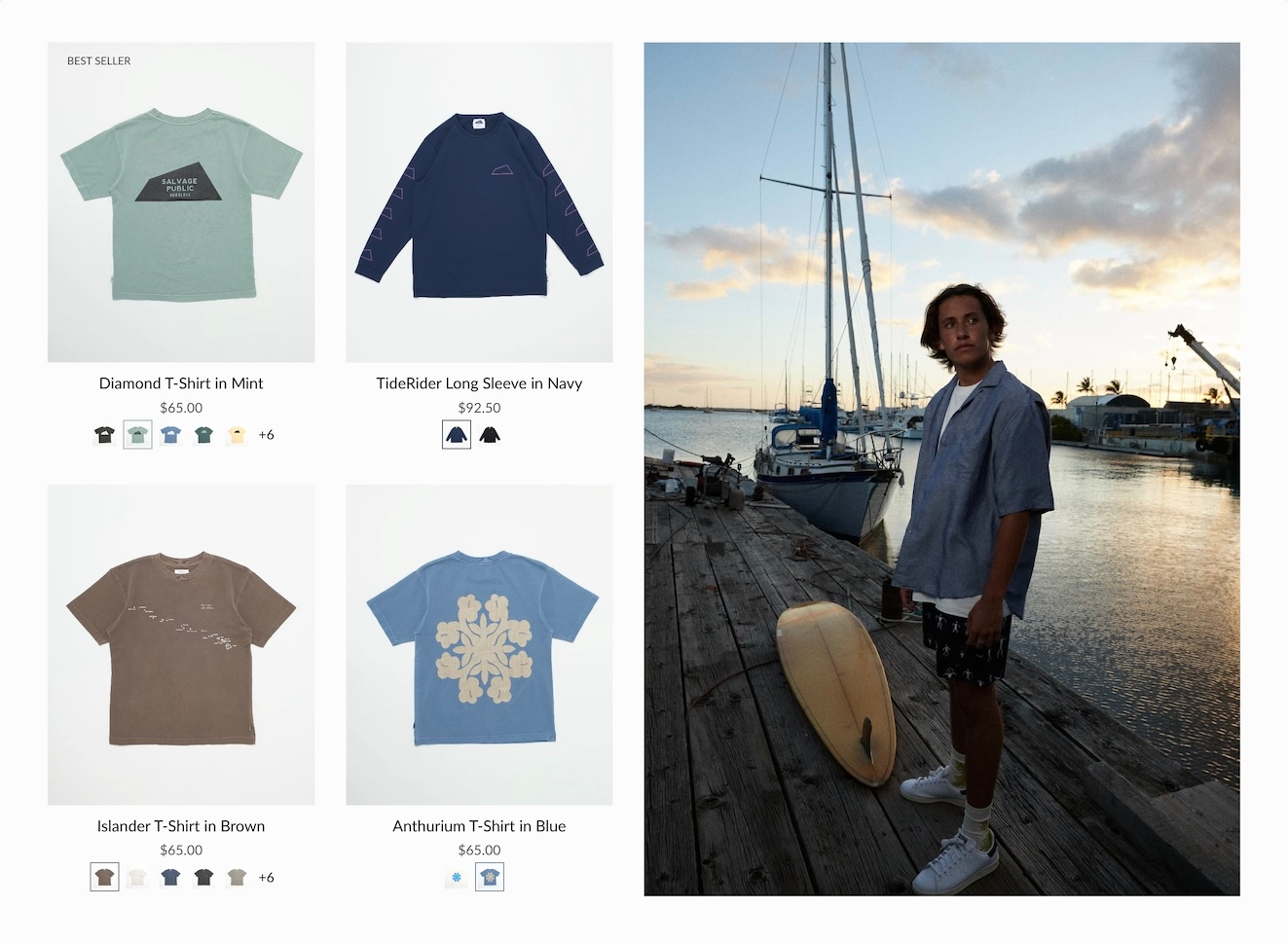
A clean text version that displays the number of swatches or siblings which are available:
Swatches with text
Displays a sample of swatches or siblings on a single line and indicates how many additional options are available with text:
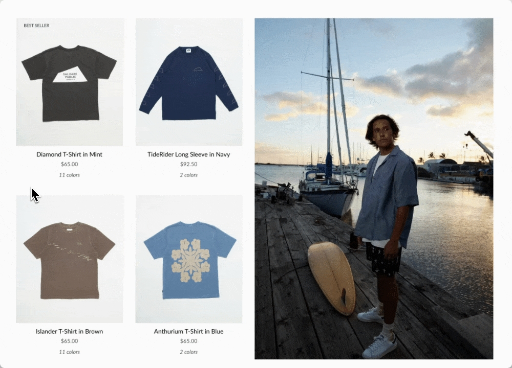
Slider
Displays the swatch or siblings slider on one line at all times:
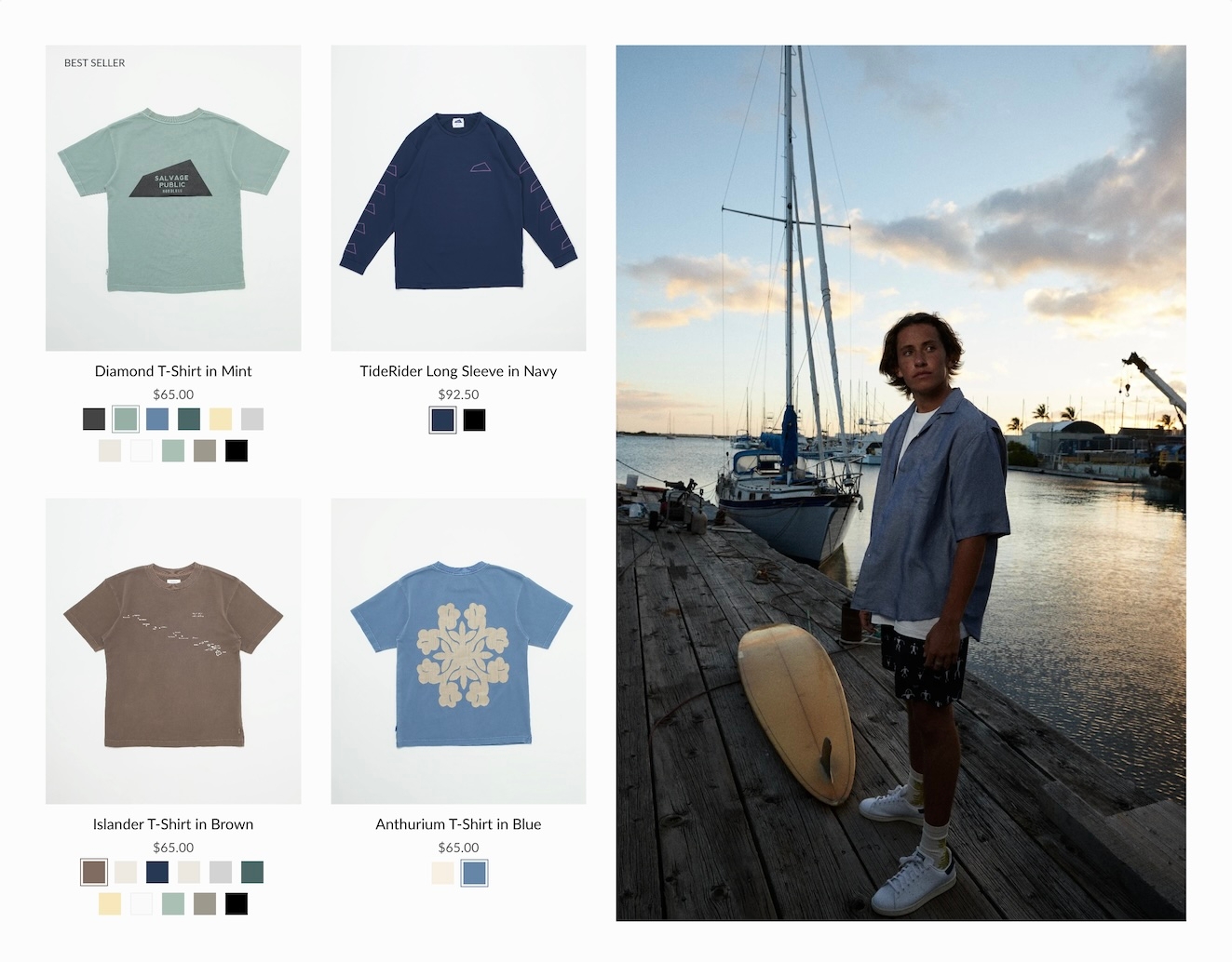
Grid
Displays all possible swatches or sibling options that are available to choose from:
How to configure
Use the global Theme Settings -> Swatches -> Collection style
Choose your collection style in the drop-down:
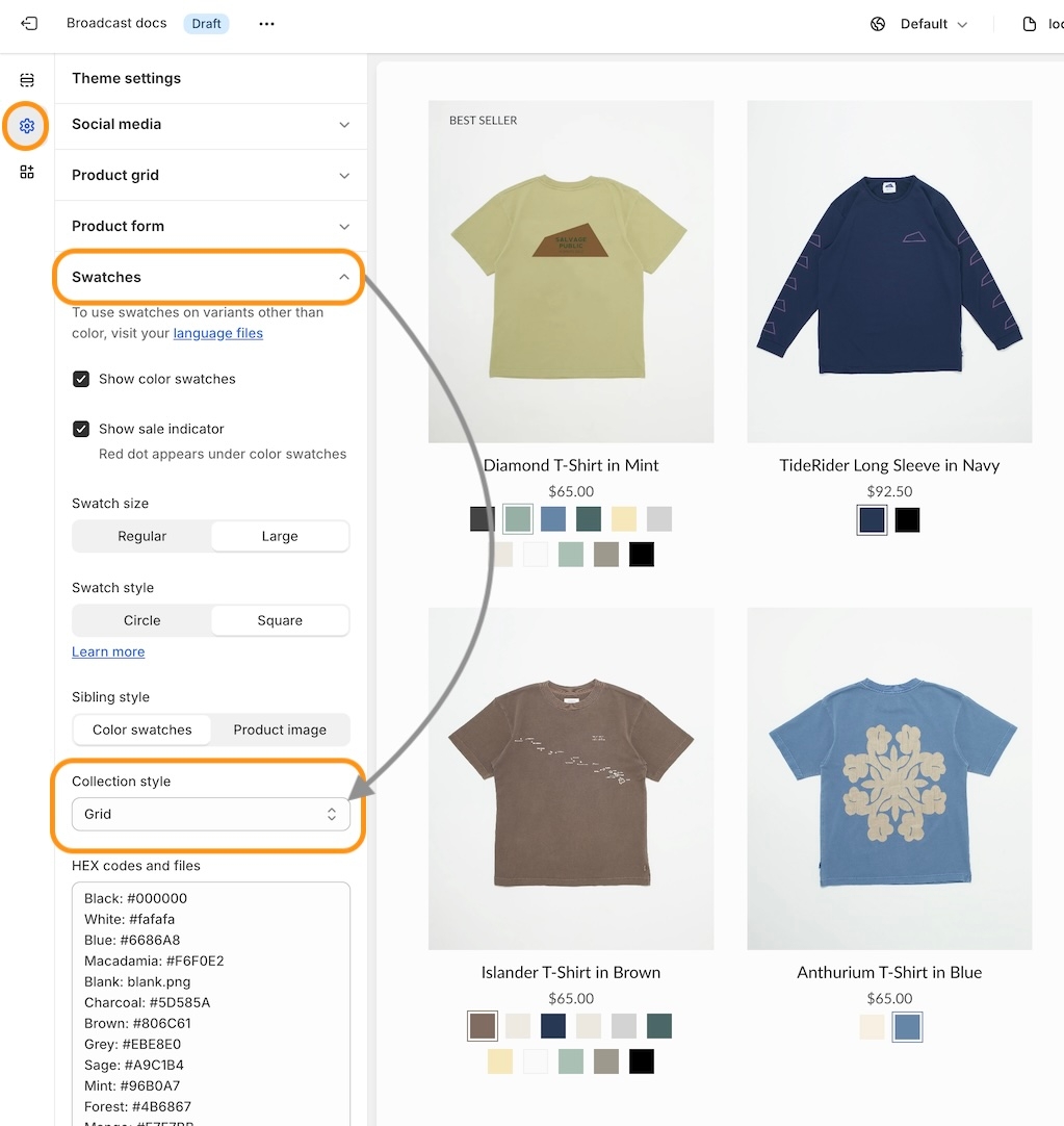
Save your changes.
Speed and performance
The load time for collections and the product grid increases significantly when many swatches are loaded. Stores looking to improve the load times can use:
Text only
Swatches with text
These two require the fewest queries to be sent to Shopify's backend when loading a collection page or product grid section. Text-only is the fastest, as it doesn't need to load any images. Swatches-with-text only loads five swatches, which is a good balanced option.
The slider and grid styles will load all swatches, making them the slower options. To help reduce the number of queries, decrease the number of items displayed per page. This method will help optimize load times regardless of which swatch style you choose.
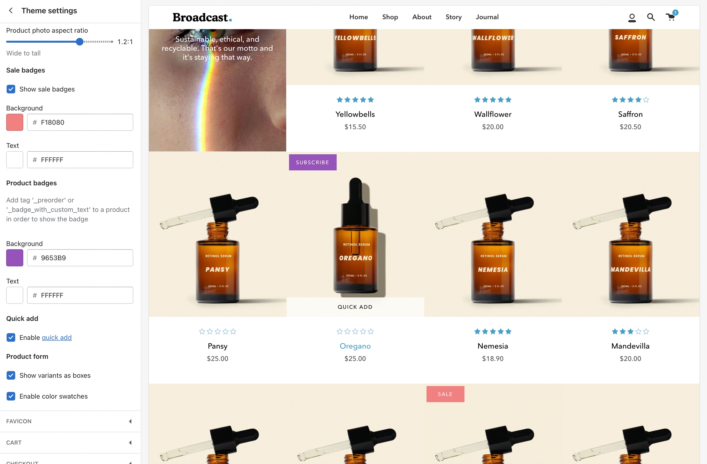
Product badges
Add custom product badges or sometimes known as stickers to individual products
Custom product badges in Broadcast allow you to create any type of badge or sticker for each of your products.
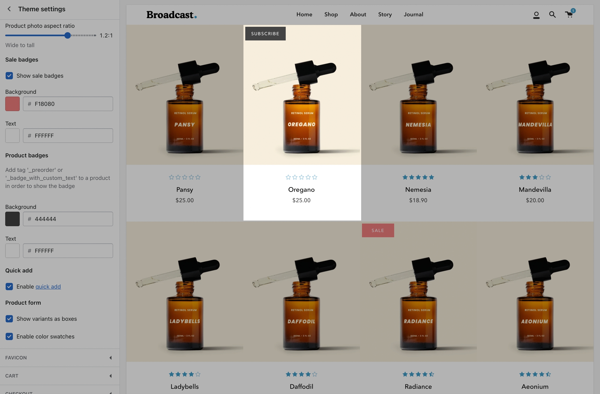
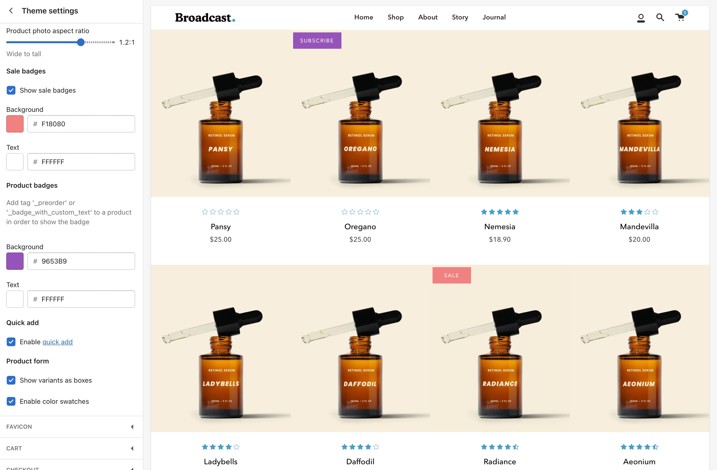
Badge colors
Use the theme settings to modify the background and foreground colors for Sale badges and Custom product badges:
How to create custom badges
Custom badges are easy to create and all done in your Product setup. You simply add a tag to any of your products with a custom prefix.
When Broadcast sees the custom tag, it sticks the badge right onto the product in any grid view like collections, searches, recommendations, and more.
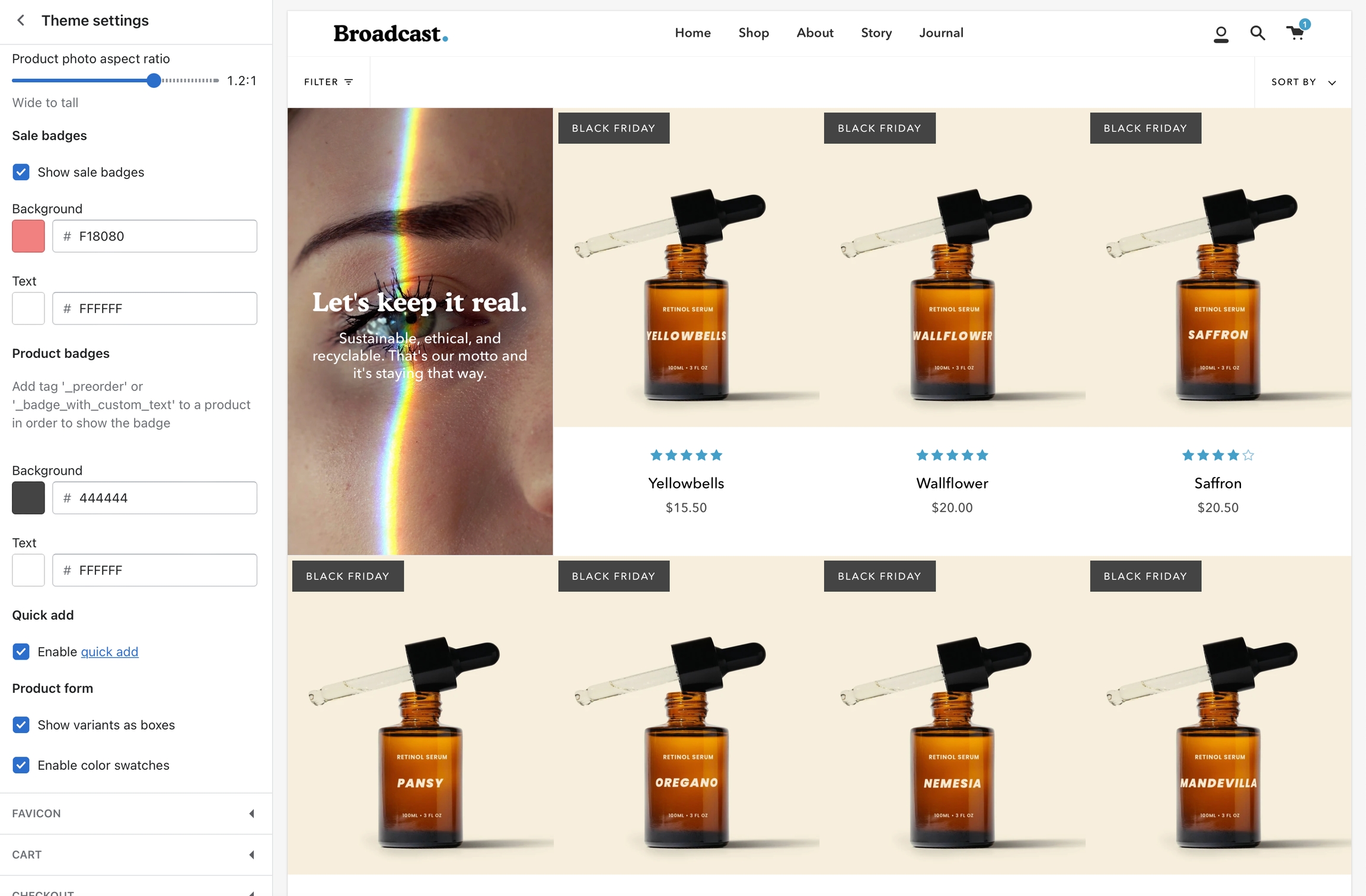
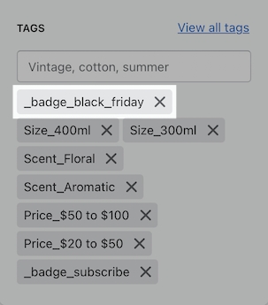
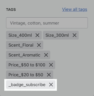
Creating custom tags
When Broadcast sees a product that has a tag beginning with _badge_, it will take the following portion and apply that as the custom badge.
Example: _badge_Black_Friday or _badge_Black Friday
Displayed as:
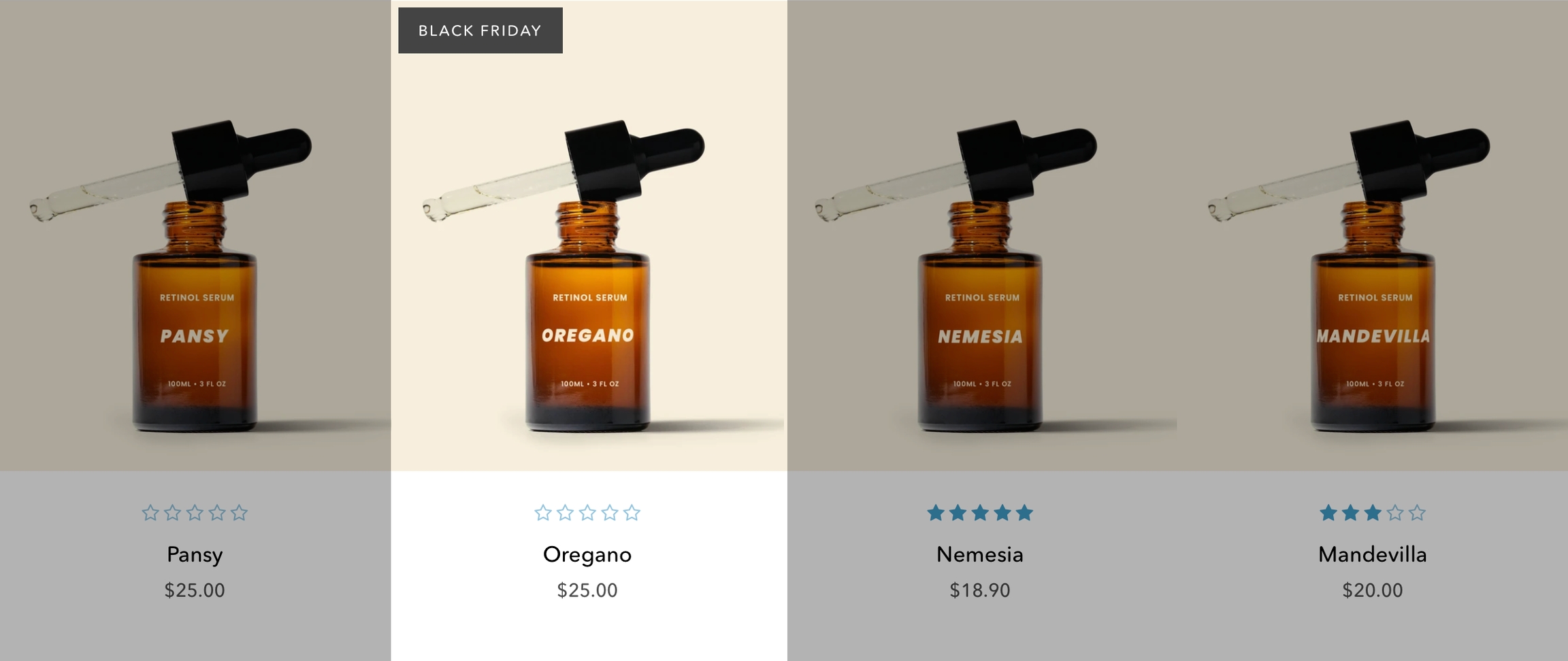
Additional examples
Tag: _badge_subscribe
Displayed as:
Product badges with metafields
Add custom product badges to individual products easily using metafields
Feature introduced in Broadcast 3.2
Broadcast makes adding custom individual product badges or sometimes known as stickers very easy to implement and manage by using metafields.
When utilizing metafields you simply create one metafield to activate the functionality. From there you can add badge text to any of your products and Broadcast will automatically generate a custom badge for that product on collection pages or any section using a product grid.
How to setup
If your shop is using Broadcast v3.2 or higher, you can easily use this feature. The following quick video shows you how to set up the custom metafield and how to use it with products:
Reference
You can use the following reference information to help with the steps covered in the video.
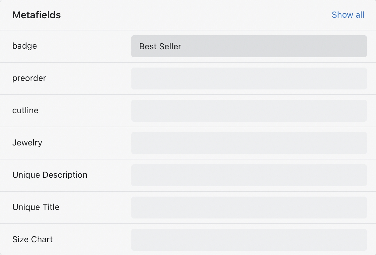
Metafield definition
Create a product metafield with the namespace and key set to:
theme.badge
Set the content type to Single line text, with one value:
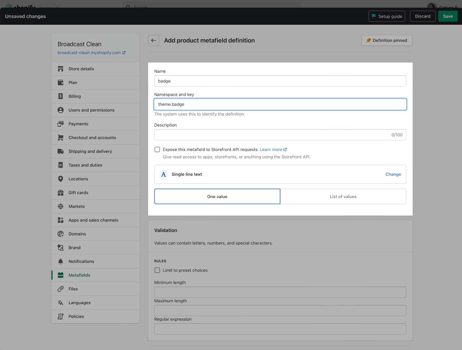
Product setup
In the Metafields section of any product that you'd like to use the feature. Add a value to the badge field.
This will become your custom badge when displayed in a collection or section that includes a product grid:
Result
When viewing a collection page or section with a product grid-style list, the custom badge is added to the top left corner if the product exists in that listing:
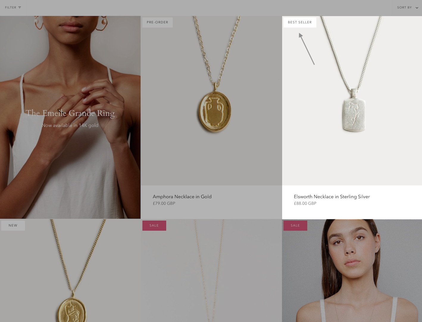
Each product can have its own custom badge label.
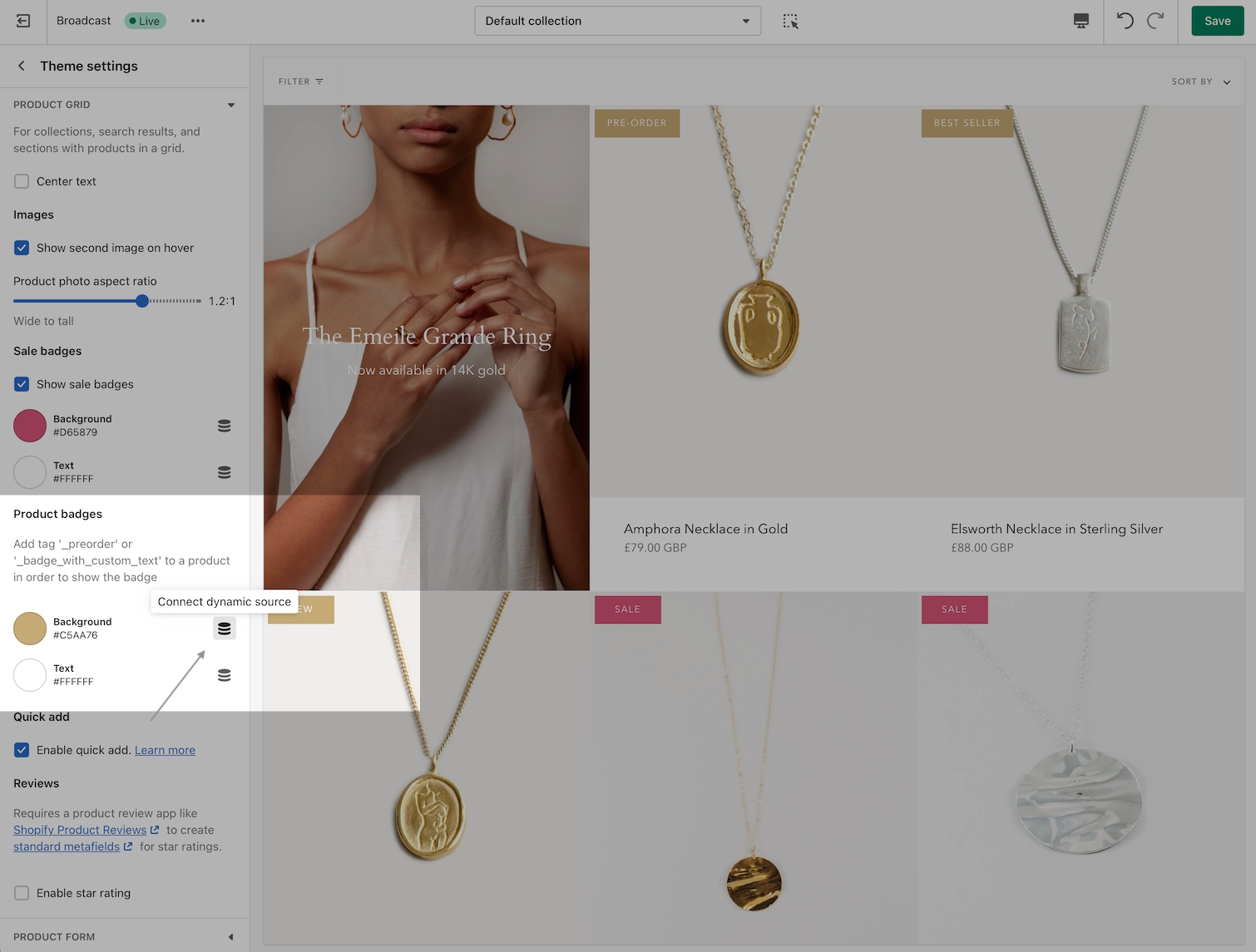
Badge colors
Colors are managed in the Theme settings tab under 'Product grid'.
Choose the background color and text color to set for all badges. Sale badges have their own values to help differentiate them from other badges:
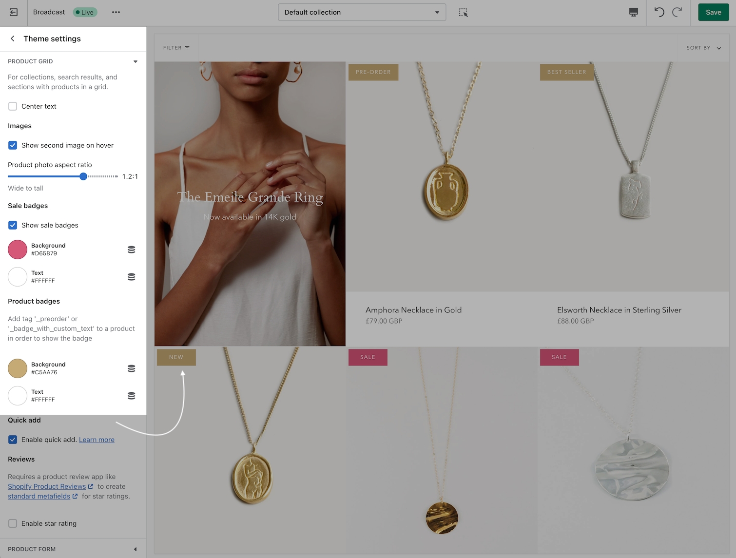
How to find theme settings:
Brand colors
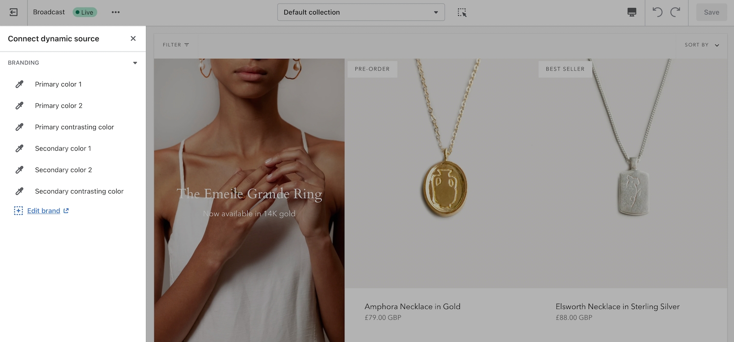
The data-source option for badge colors allows you to choose colors you've already configured in your brand colors configuration:
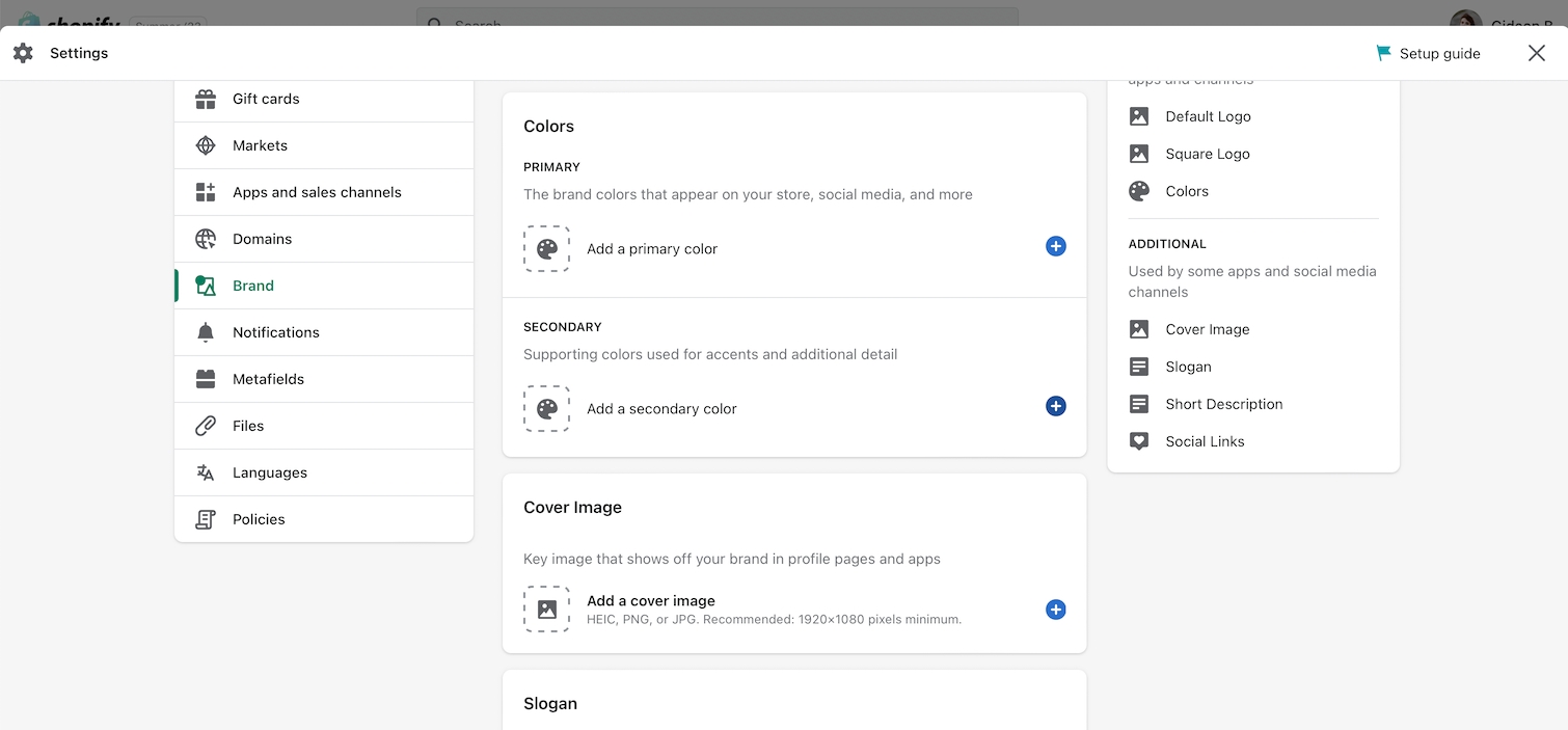
Brand colors are configured and managed in the Shopify admin settings under 'Brand':
Product filtering
Collection filtering
Broadcast supports Shopify's Online Store 2.0 Product filtering for fast, customizable, and reliable collection filtering.
How to setup
Setup with Broadcast is fast and simple. Using the Theme Editor, navigate to any collection page (or choose the default collection template) and click on 'Collection products' to view the settings:
Steps:
Enable filters
Customize filter options and sort order
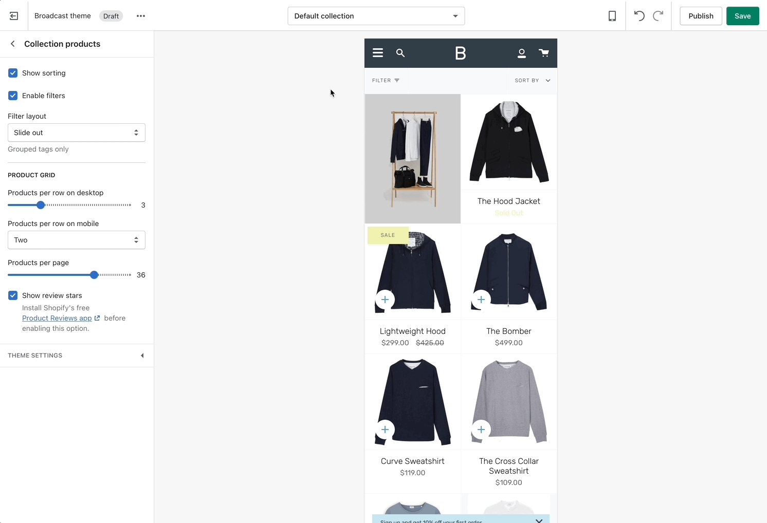
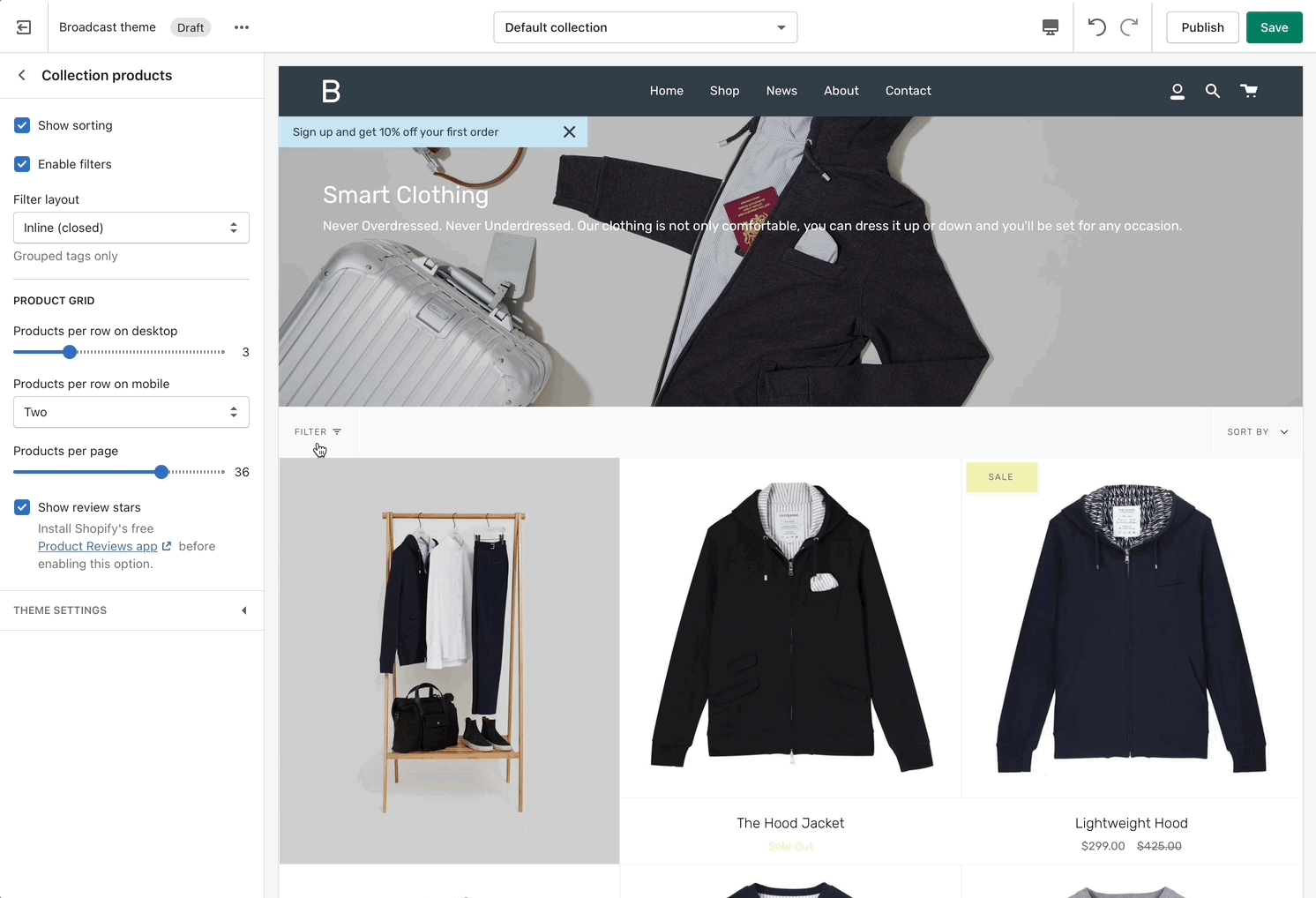
Filter layout options
Slide out
'Slide out' has a larger area and uses the entire height of the shopper's browser or device:
Inline (closed and open)
Inline places the filter tools within the collection area for both desktop and mobile.
When using the closed Inline option, the customer can click or tap on the filter heading to open, the product grid becomes smaller as the filter tools animate open.
Part 2 - Shopify Search & Discovery
The rest is all done using the Shopify Search & Discovery app. Using the app, you can customize which filter options to display and sort the order.
Watch this quick video on how to customize the filter options:
Download Shopify Search & Discovery:

Quick add
Quickly add items to cart from collection pages
This article is for Broadcast v3 and newer
The Quick Add feature in Broadcast allows customers to add products to their cart without leaving the page they are on.
When Quick Add is enabled, customers can either purchase the product immediately or, if the product contains variants, use the Quick Add drawer to choose variant options:
Products without variants are instantly added to the cart with one click when using Quick Add.
How to enable or disable
Quick Add can be toggled on and off in the Theme settings under Product Grid:
Sub-collections
Promote related collections on any collection page
Cross-promote other collections with sub-collections. Display a carousel or grid of links to related or similar collections on any collection page:
How it works
Broadcast uses Shopify's Navigation menu system to bring custom menu items into any collection page and displays them as sub-collections with a graphical image, collection name, description, and link.
How to setup
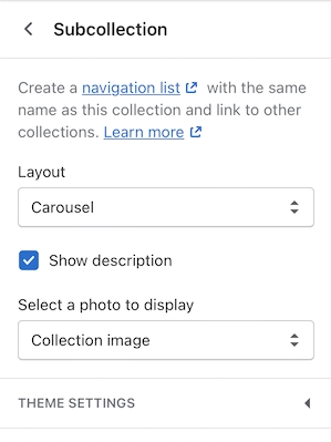
Sub-collections are already included with the default collection template, listed as a section called 'Subcollection':
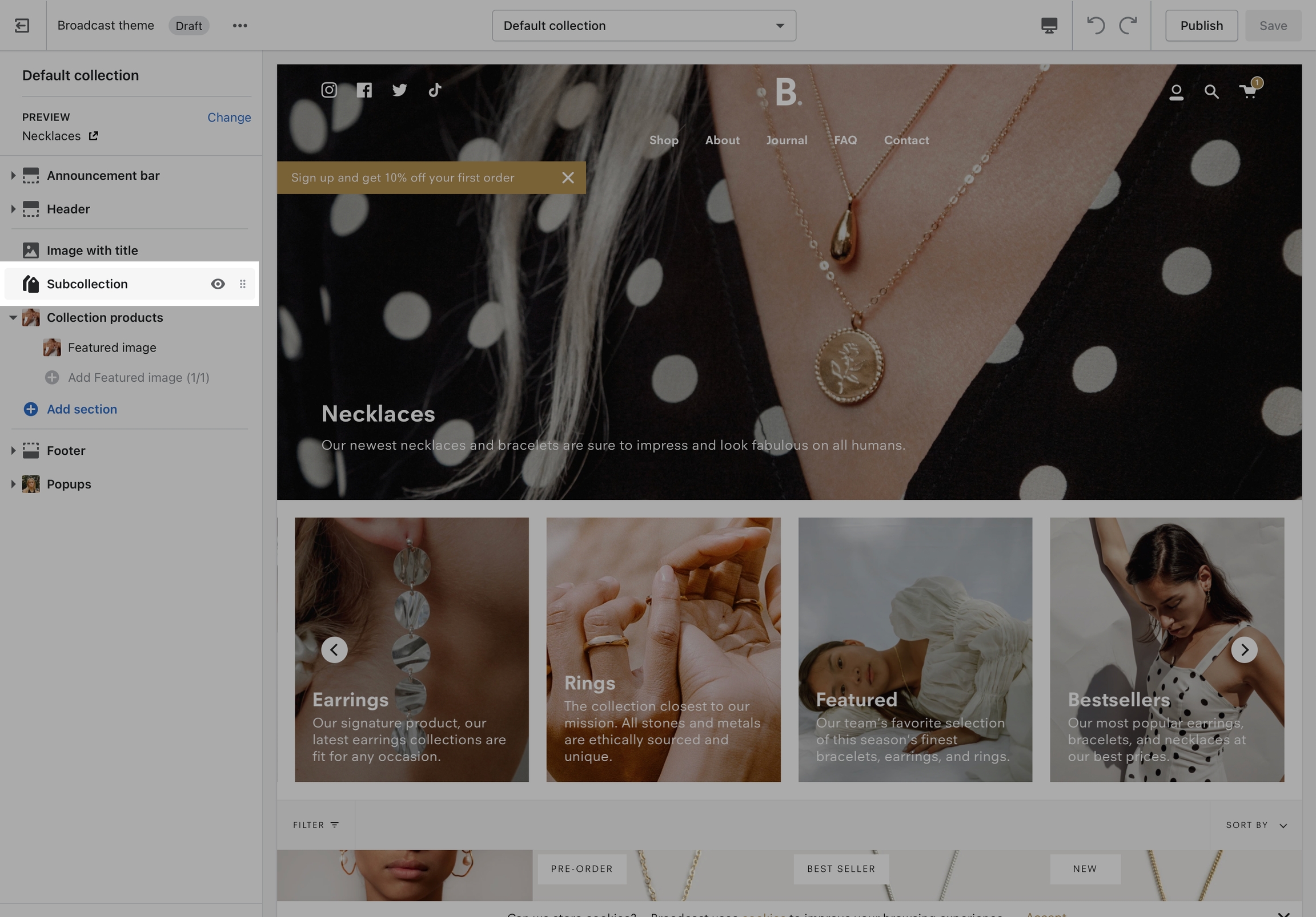
Settings for Subcollection:
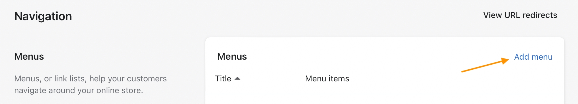
Adding collections
Use the link in the settings to create a navigation list, the rest is done right in your Shopify Admin under Navigation. Choose 'Add menu' to create a new menu:
Create a new menu with the same name (and/or handle) as your collection:
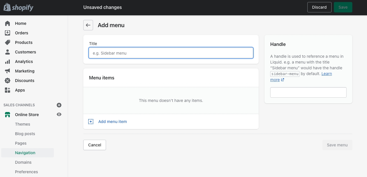
For our example, we will be adding sub-collections to our Necklace collection, our menu will be called Necklaces and the handle in lowercase: necklaces
Next, we'll add menu items, these will be the sub-collection links that are displayed in the sub-collection carousel or grid:
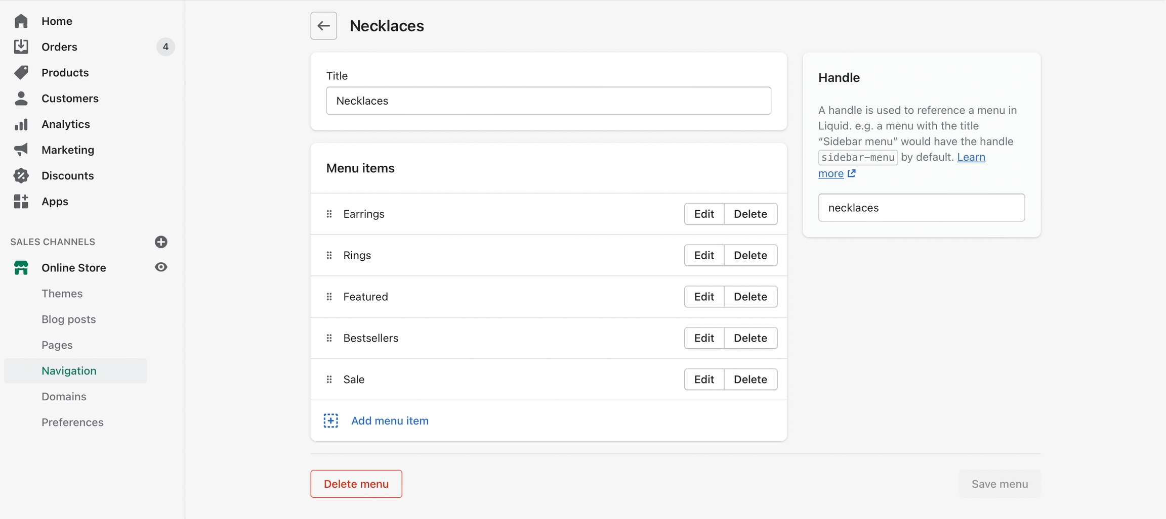
Create a new menu item for each collection that be listed as a sub-collection
Save your menu and your sub-collections are ready to use.
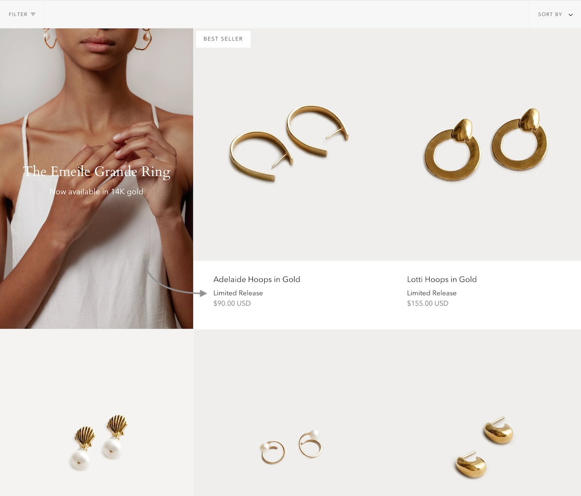
Cutline second line
Add a second line of unique text on collection pages
Feature introduced in Broadcast v3.2.0
Add a custom tagline to individual products using metafields. The tagline will appear styled in the product grid on collection pages and any section using a product grid view:
How to setup
The first step is to add or define a new product metafield. This is a custom metafield you'll create the Settings of your Shopify Admin.
Add a new product metafield
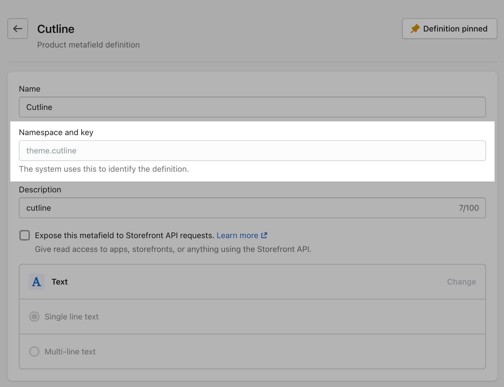
To set up a Cutline, you need to create a new custom metafield definition that Broadcast can recognize.
The most important part is to use this namespace and key: theme.cutline
How to create the metafield
To start, navigate to your Shopify admin settings and open the metafields tab from the left panel. Next, click on 'Products' (click images to zoom):

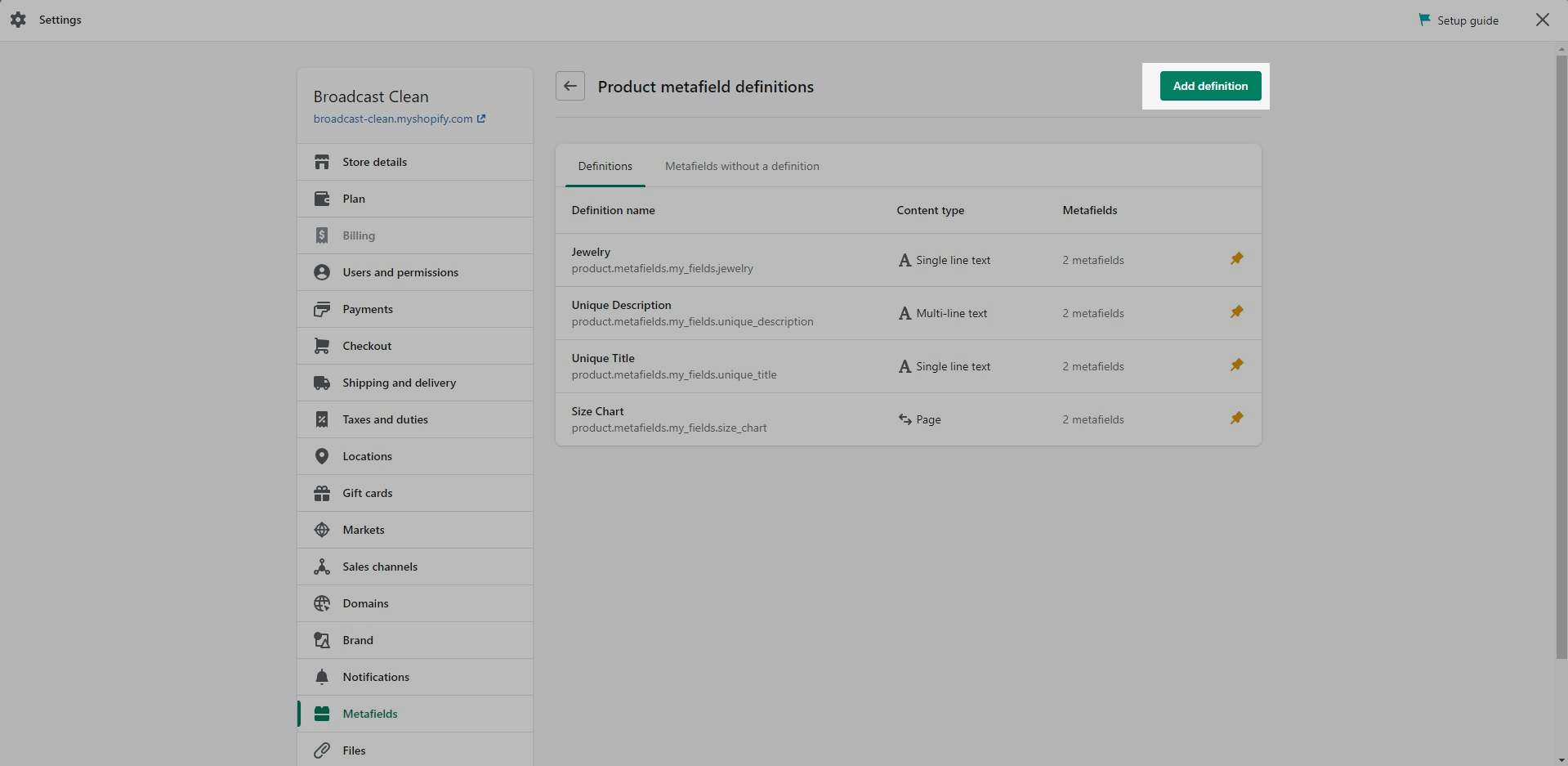
Click the 'Add definition' button to begin. Choose a name, we'll use 'cutline'. Next, we'll use a custom namespace.
A crucial step here is to change the default namespace (usually called 'custom') to theme

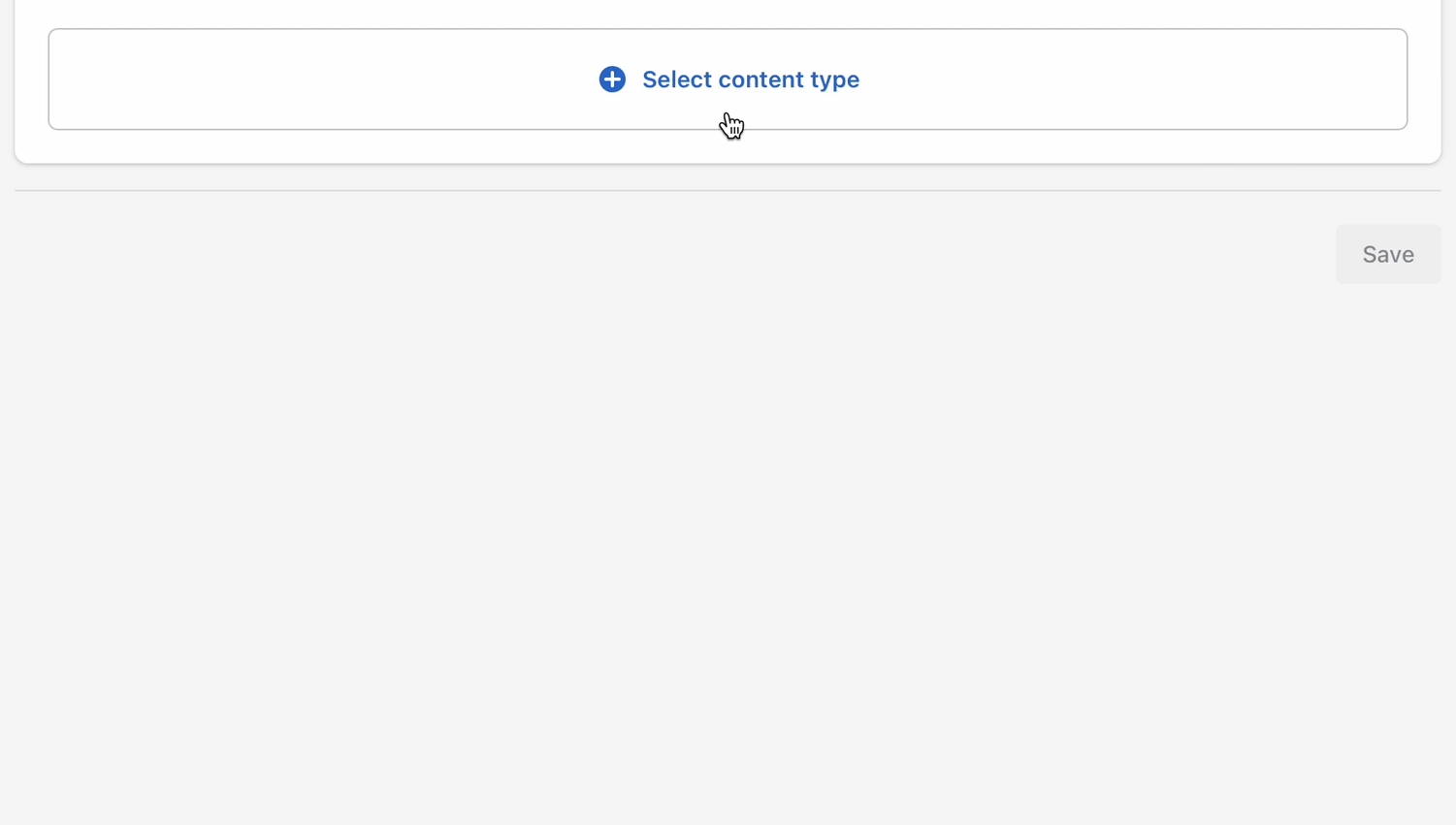
Add a description (optional) then select 'Single line text' as the content type.
Don't forget to save your changes.
Product setup
Now that our custom metafield has been defined, the final step is to edit any of your products in the Shopify Admin -> Products and update the new cutline metafield.
All you need to do is scroll to the bottom of the product setup page and fill them in:
After adding the cutline metafield value don't forget to save the product changes.
Now you're ready to preview the cutline text. View on a collection page or any section that uses the product grid layout:
Your cutline text will only appear for this product. You can now add unique cutline text to any product in your store.
If a product does not have the cutline metafield text information added, nothing will appear.
Only products with a value for the cutline metafield will display that information on the product grid or collection page.
Add your unique cutline information for all/any products that require the cutline information displayed on collection pages and product grid sections.
Featured image
Branding and promotion space for collections
Add a featured image to the first column and row of your collections to help promote your brand and product line:
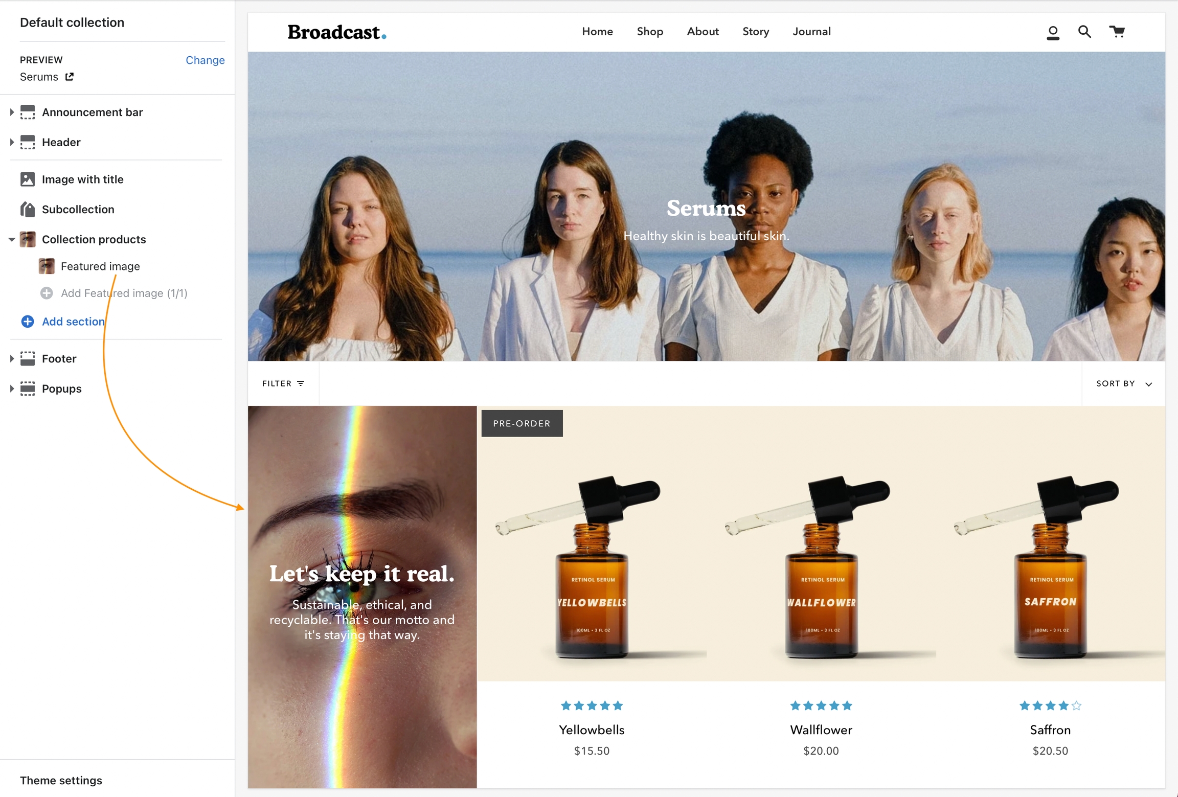
How to use
'Featured image' is a content block for the Collection products and Featured collection sections. Click the arrow to the left of the section to add blocks: